Designer Shannon Eddings Transformed a Five-Bedroom House in Austin Into the Ultimate Bachelor Pad
How do you make a 4,167-square-foot, five-bedroom home functional for just one person? That’s what a bachelor returning to his native Austin, Texas, tasked interior designer Shannon Eddings with accomplishing after he found a classic 1980s home steps from a beautiful hiking trail.
“It was a very different experience working for one person who would be living alone in such a large space,” says Eddings. “Our client loves color, pattern, the 1970s, and music, so we took that into account when creating the interior decoration. He also has a penchant for English eclectic design, which is basically my middle name these days. I can’t get enough of the quirky, colorful approach that a lot of English designers take when decorating.”
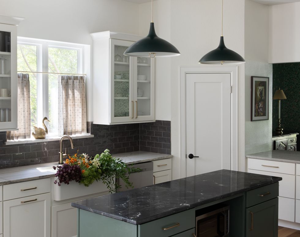
The home had been updated in the early 2000s but was otherwise untouched. Eddings worked with the homeowner’s contractor to gut the bathrooms and add updated custom cabinetry; open up the wall between the kitchen and family room; and replace the flooring throughout the house with new wood flooring. The kitchen was updated by the previous owner, so Eddings simply painted and replaced the hardware and lighting.
More From House Beautiful

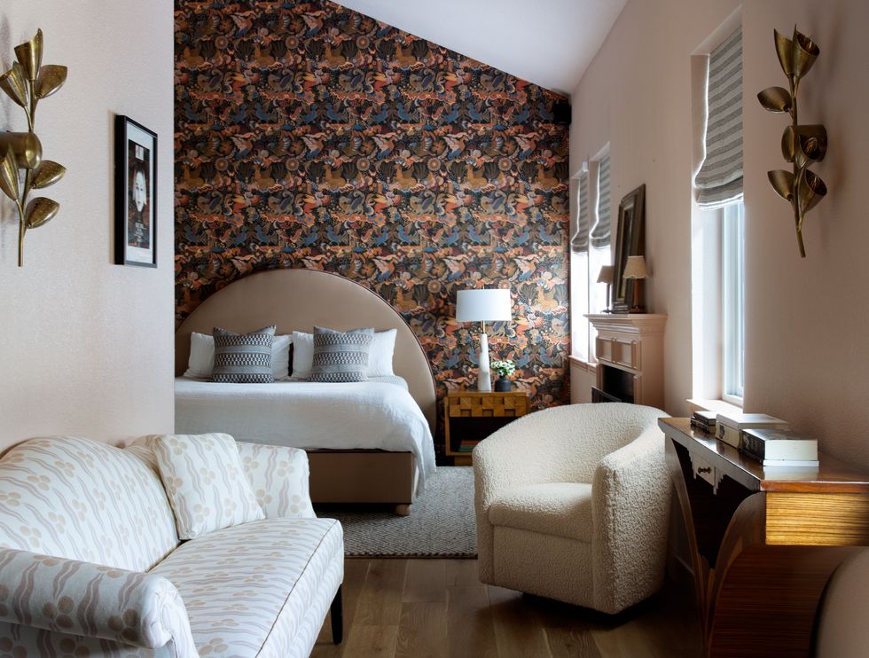
To best make use of the space, Eddings converted one of the bedrooms into a music studio, another into a gym, and then combined another with the primary bedroom to create an office. In the primary, she also created an in-bedroom sitting area with a record player.
“It’s such an exciting challenge to bring architectural detail and interest into a basic spec-like home,” says Eddings. “It’s key to layer in bold paint and pattern to create some tension and excitement in the home.”
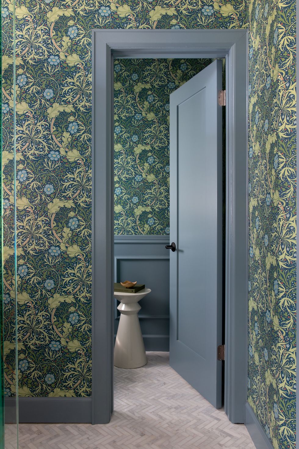
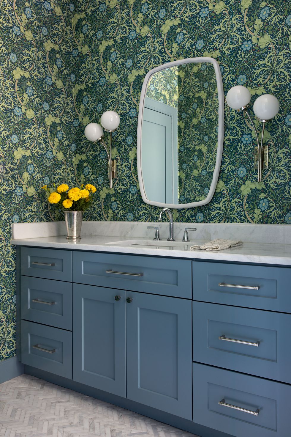
She did just that with custom window treatments by Zak+Fox; Sanderson wallpaper paired with green cabinetry in the powder bathroom; William Morris wallpaper in the dining room; Turkish and Moroccan rugs; and saturated paint hues.
“Don’t be afraid to take risks with color and experiment with unique and unexpected shades,” says Eddings. “When a client trusts us to decorate everything, the finished home just flows so much better.”
Living Room
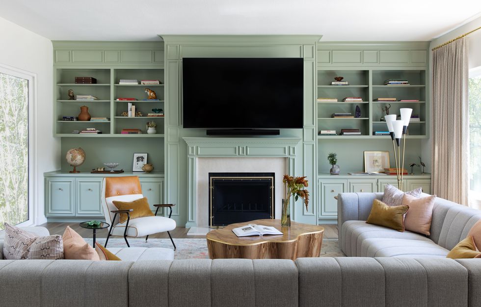
Instead of tearing out the outdated built-ins, Eddings added custom moldings and bright green paint. The sectional is by Four Hands, the coffee table is Arteriors, the chair is by Anthropologie. Eddings also installed a Turkish oushak rug.
Kitchen
Adding a fresh coat of paint, replacing the hardware, and updating the light fixtures made all the difference in this kitchen.
Breakfast Table
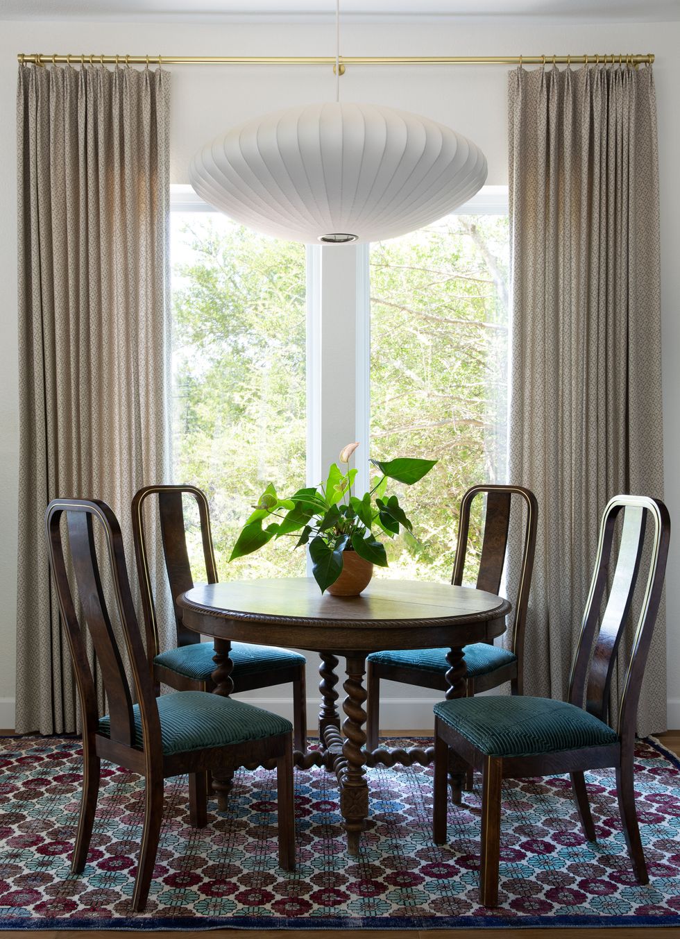
“We saved money in the kitchen nook by sourcing the antique dining chairs and the light fixture above the table off Craigslist,” says Eddings. “We were running out of money and had to get creative. In getting creative, we also got lucky.”
Dining Room
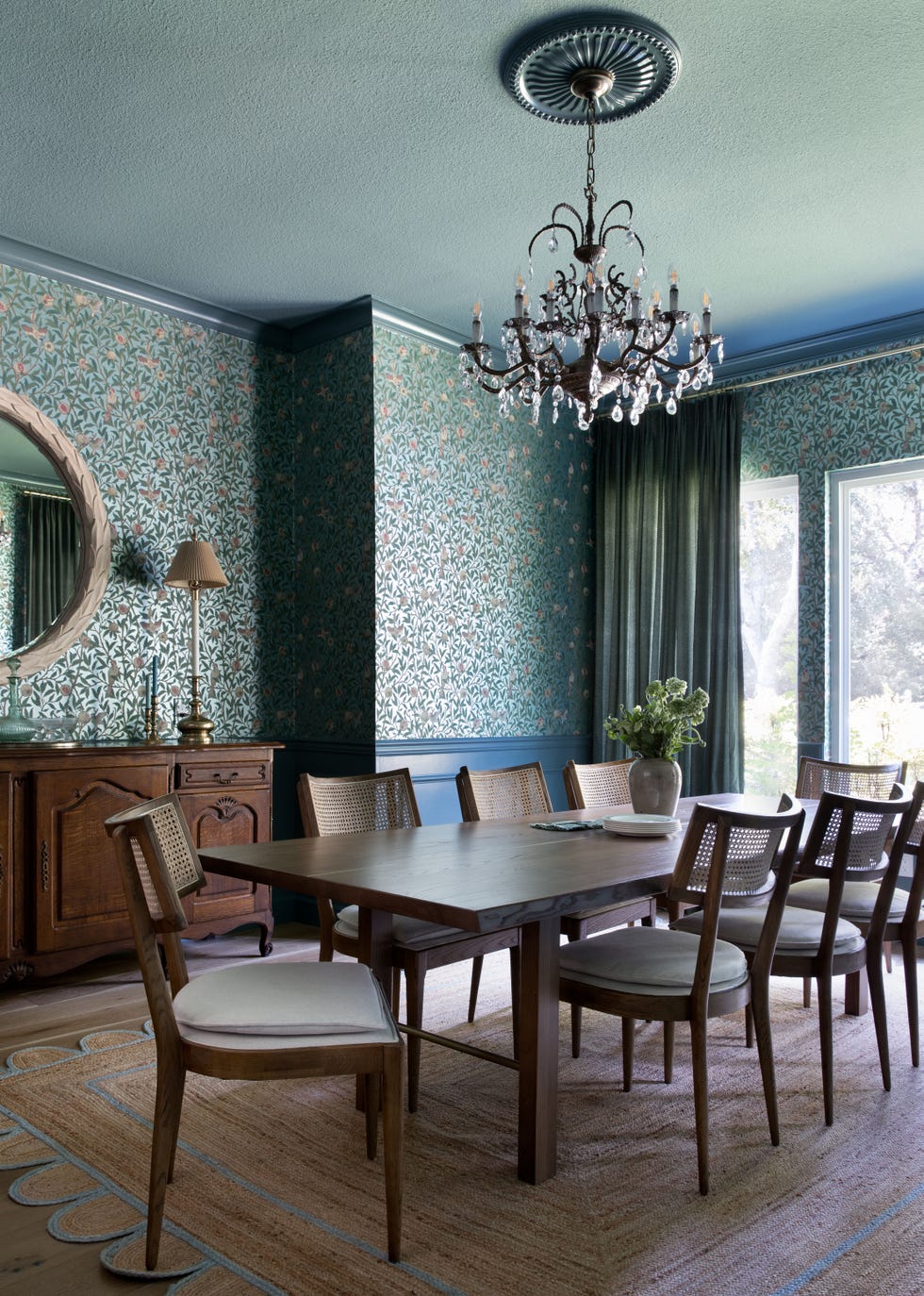
A standout William Morris wallpaper pops against antique furniture in the dining room.
Primary Bedroom
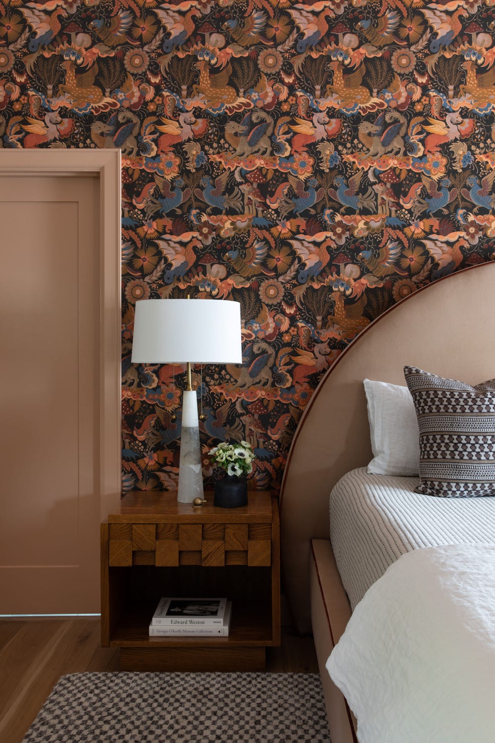
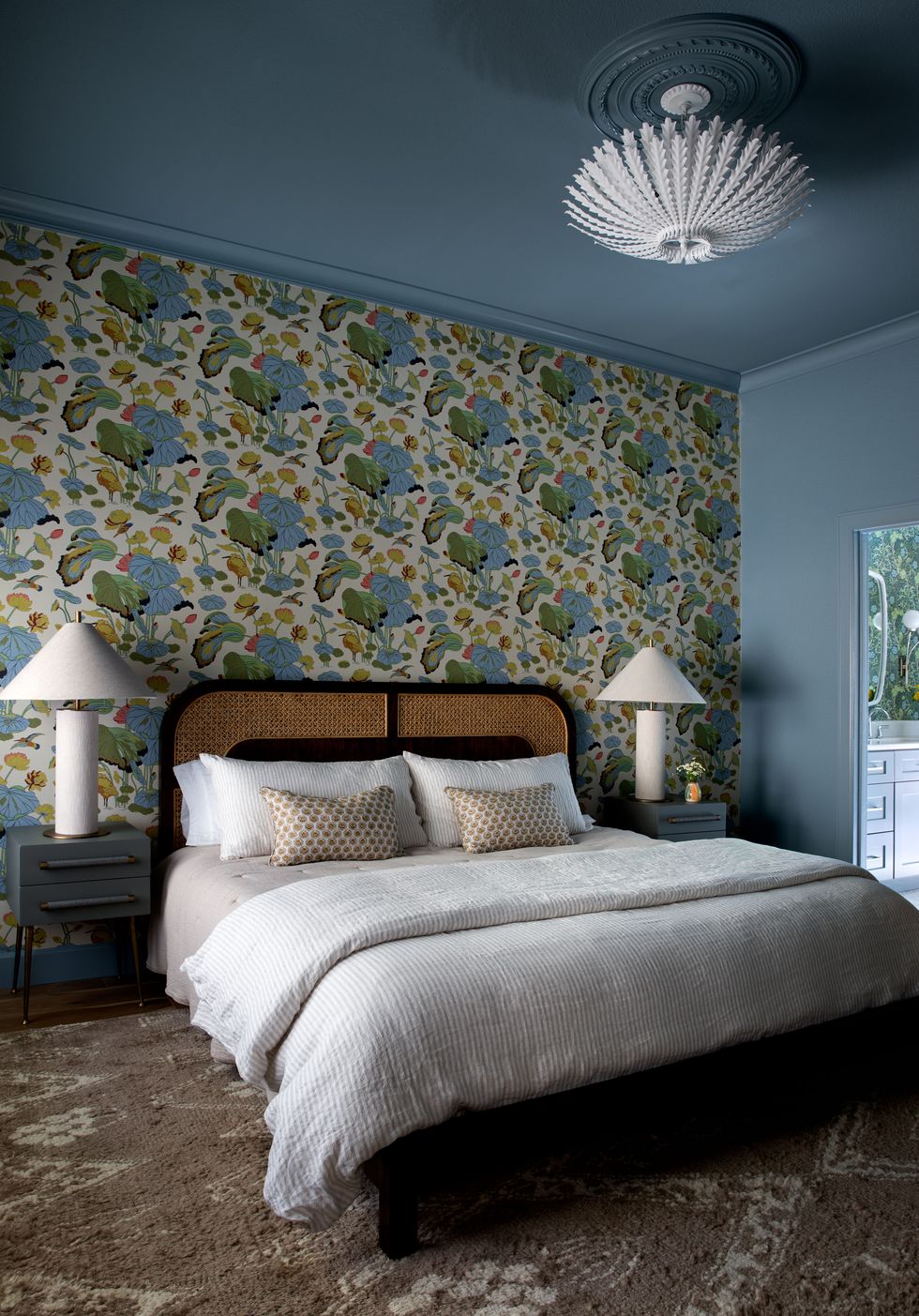
“We designed a really beautiful bed with a big curved arch on the headboard in Italian velvet with contrast trim,” says Eddings. “We love the detail and the bun feet.” She also installed House of Hackney wallpaper.
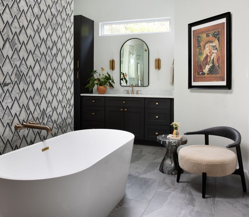
Primary Bathroom
A black-and-white palette makes for a soothing transition from the primary suite.
Guest Bedroom
The wallpaper is by G P & J Baker, the nightstands are Chelsea Textiles, the lamps are Crate & Barrel, and the bed is by CB2.
See More of the House
Q & A
HB: What was the process like?
SE: When your client is in love with the 1970s, it’s exciting but can be a little scary trying to rein in some of the pattern and color. It was really cool to see him respond to some nice classic wallpaper patterns and see him respond to the more refined ideas we had that hinted at the 1970s. The wallpaper in the powder bathroom from Sanderson is the most 70s looking piece in the house, and we all loved the way it turned out with the green cabinet.
HB: What were some challenges along the way?
SE: The most difficult part of the whole project was navigating the availability of furniture and fabrics due to the pandemic. The whole remodel took place in the thick of Covid, so it changed the way we decorated. We ended up sourcing a ton of vintage furniture.
HB: Where’d most of your budget go?
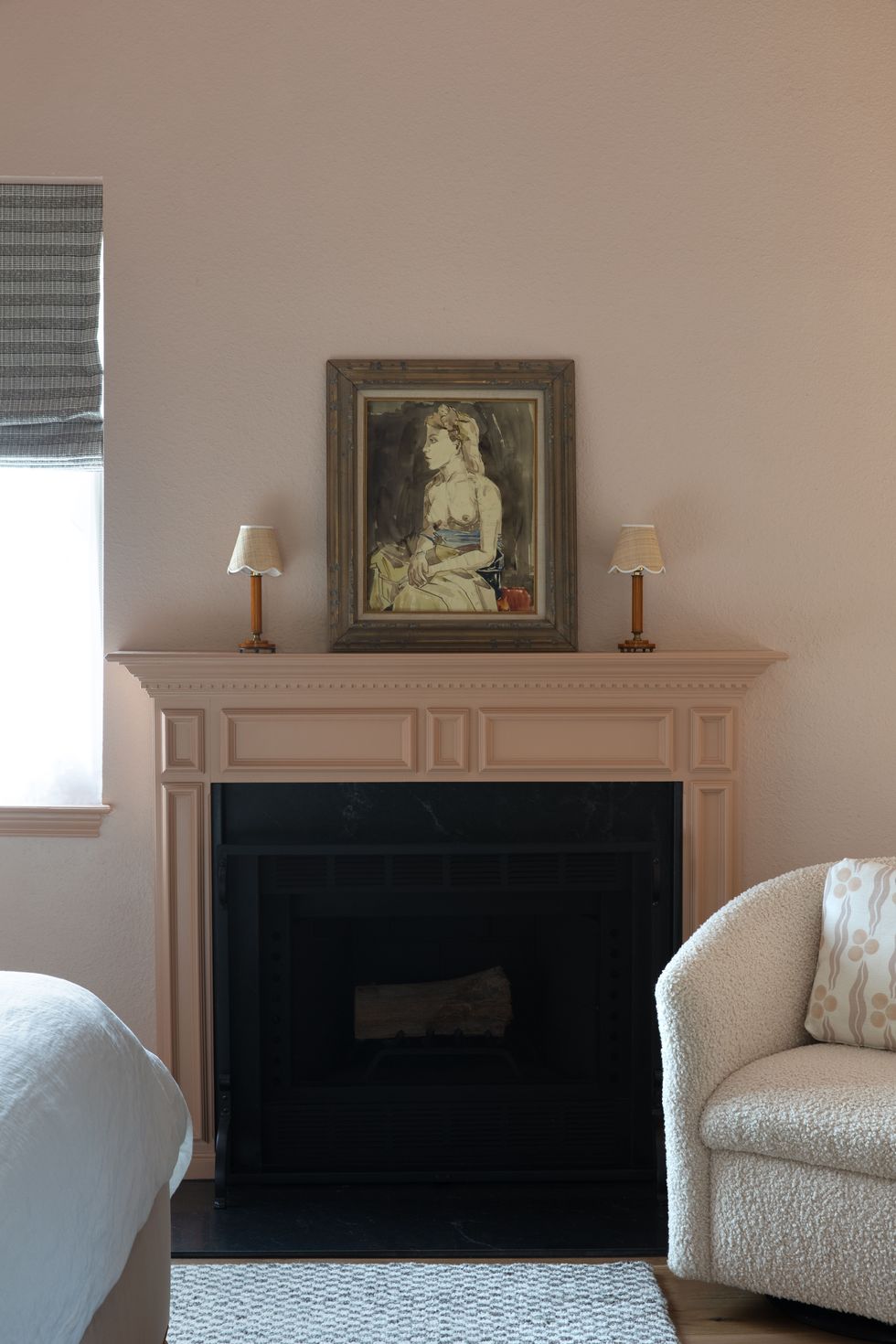
SE: We invested heavily in custom window treatments as well as wallpaper and light fixtures. We love furnishing homes. The best and most successful projects are the ones that include the finishing touches. We love to pull out a color that is hinted at in a wallpaper and use it on the cabinet or walls. Another great example of this is on the walls in the primary bedroom, where we went with a peachy pink to complement the tones in the House of Hackney wallpaper.
Follow House Beautiful on Instagram.
