Clever color use adds homely decor to this Hollywood house
There are some world-class interior design ideas coming out of the West Coast right now. From Brigette Romanek’s decor for Gwyneth Paltrow’s new home, all curved shapes, natural light and indoor trees, to Axel Vervoordt’s subtly textured minimal architecture for Kim Kardashian. There seems to be a revelry in the amount of light which can pour through a Californian window, a new appreciation for being able to walk into a sun-filled home, kick off you shoes and sink into a rounded seat that is both elevatedly elegant and supremely comfortable.
And following in this new tradition – and in fact moving this look on with a fine art-level appreciation of how to use color – is the design studio LALA Reimagined. Founded by Lia McNairy and Azar Fattahi, the duo have been creating a fleet of modern homes in such alluring places as Malibu and Palm Springs.
This home in the Hollywood Hills epitomizes what they can do, and is at the forefront of current interior design trends. Built in 1941, and approximately 52,000 square feet, it is full of incredibly clever color tricks, through lines and talented design decisions which turn it into a sophisticated space where the emphasis is on being able to gently waft, barefoot, from one room to another.
‘Our clients love color,’ Lia says. ‘One of their main requests was wallpaper, so this became our jumping off point. We wanted to to create a space reminiscent of a small hotel, where every space is functional without skimping on design. Once we had identified the wallpapers – and there’s quite a bit of it – that dictated the mood and direction of the furniture pieces we chose.’
Grand – but not too grand – entrance
(Image credit: Roberto Garcia)
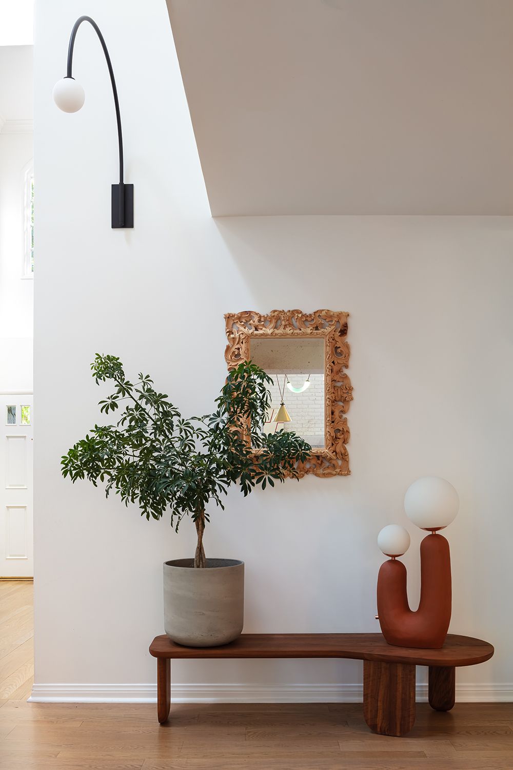
An entryway bench is a key part of the modern Californian vibe – a spot to relax on the moment you get home. But in the hands of LALA Reimagined, nothing can ever stay at level one!
‘The intention for this spot was to have a place near the front door to take off your shoes, but it ended up becoming an art installation once the placed the light on the bench,’ Lia says. ‘It has since become a talking point in the evening when the lamp is on.’
Sculptural trees in pots are another key micro trend coming out of the West Coast. ‘We were drawn to the braided trunk, but if we need to get technical it’s a schefflera arboricola,’ Azar says. ‘Don’t ask me how to pronounce it.’
The bench is from De La Espada, and lamp is by Eny Lee Parker. The Contour wall light, up high, is by Allied Maker.
Clean sweep
(Image credit: Roberto Garcia)
Straight out of the Hollywood Regency era, the balustrade sweeps impressively up from the entryway. ‘The staircase was original to the house, but brown,’ Azar says. We painted it black to make it reminiscent of Jean Royere and connect to our Allied Maker Contour wall sconces.’
The chairs are from The Future Perfect, and were chosen for their sculptural form to greet you as soon as you arrive in the home. ‘We find focal moments have more impact when they are not expected,’ Lia says.
(Image credit: Roberto Garcia)
An ovular – rather than rectangular – dining table feels instantly more elegant, more inviting. Without sharp corners, conversation seems to flow more easily, elbows feel more at home on the table.
‘The table was our jumping off point for this room,’ Azar says. ‘Once we saw the Patagonia marble we knew we could not live without it. Its top is shaped like an egg, so the next mission was find a chair silhouette to marry the table.’
Allowing for curves in a dining room is an easy way to create a moment of informality, even if the materials used are utterly luxe.
The table is by Baxter, the chairs from Matter and the chandelier is by Ladies and Gentlemen.
(Image credit: Roberto Garcia)
Indoor plants take the place of sculptures on plinths, works of art in their own right, but introducing a breezy, natural element.
‘We’re always trying to bring the outdoors in,’ Lia says, of their olive tree on its black platform.
The console table is a vintage Angelo Mangiarotti marble “Eros” series design from 1971.
Set the bar high
(Image credit: Roberto Garcia)
The scalloped edge of the home bar isn’t the only thing that turns this addition into more than just your average drinks corner. The countertop is made of pink onyx, one of the softest in tone yet most opulent stones you can get.
‘This is the piece de resistance in the heart of the house,’ Lia says. ‘The biggest challenge was to convince our client, who is the CEO and President of a company, that he really needed a pink onyx scalloped bar that lights up!’
‘What you don’t see in the photo is the light underneath the onyx,’ Azar adds. ‘It’s the main topic of conversation always!’
The wicker lamp is from Crate and Barrel. ‘Because you know you have to mix the lows with the highs and we can’t say no to wicker!’ Lia says. The leopard, an addition made because the designers admit they love to be whimsical, was found in a flea market in Paris.
High and low
(Image credit: Roberto Garcia)
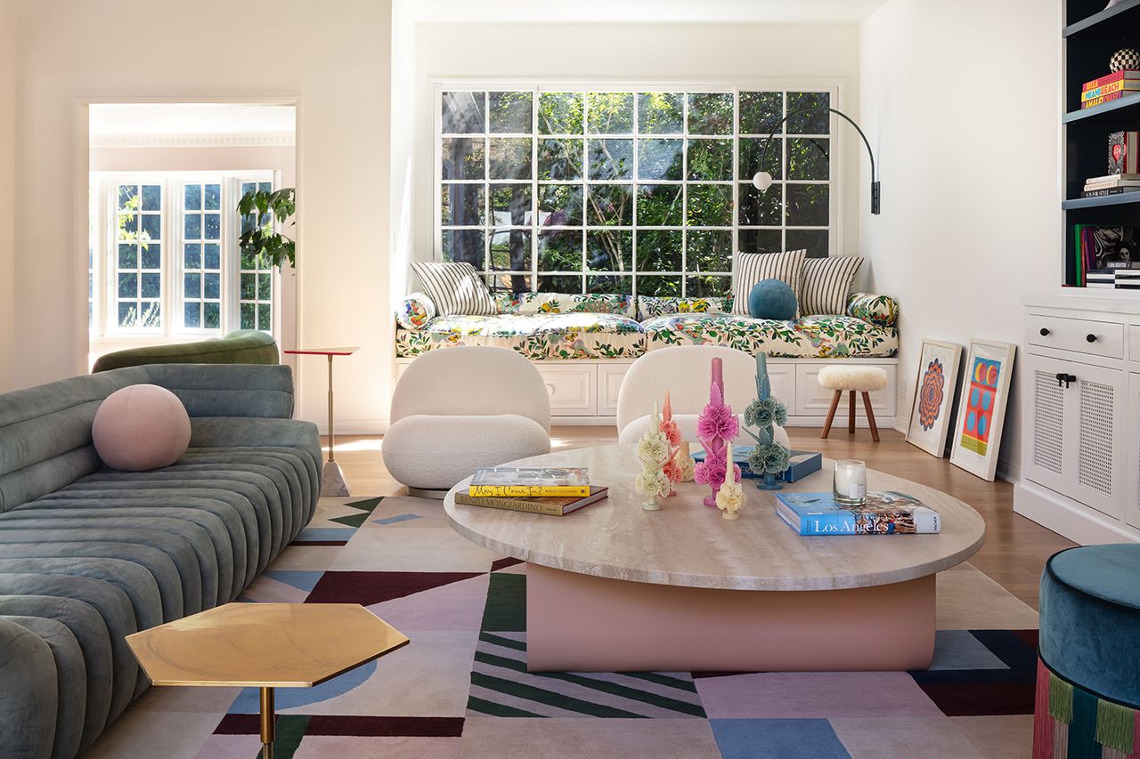
The living room TV area was purposefully created as a space to relax, but that’s not to say it doesn’t have an air of refinement.
‘We took into consideration both style and comfort,’ Lia says. ‘The ceilings are very high and the low furniture creates an overt sense of grandeur.’ The height isn’t the only contrast at work here. ‘We love that the strong lines of the triangle and heaxagonal accent tables complement the many curves we used to fulfil the space,’ Azar says.
(Image credit: Roberto Garcia)
This room is a masterclass in ways to hide your TV, using custom storage flanked by open shelving to conceal it away completely. The Tactile sofa is by Baxter, and the white Pacha lounge chairs are by Gubi.
The triangular accent table is by Good Colony, and round Ball cushion is by Pierre Frey
(Image credit: Roberto Garcia)
Window seats are a rising trend in modern house design, becoming a key place to relax, gaze, read or contemplate life. This one is covered in Citrus Garden fabric by Josef Frank for Schumacher.
The coffee table is by Egg Collective.
Follow the line
(Image credit: Roberto Garcia)
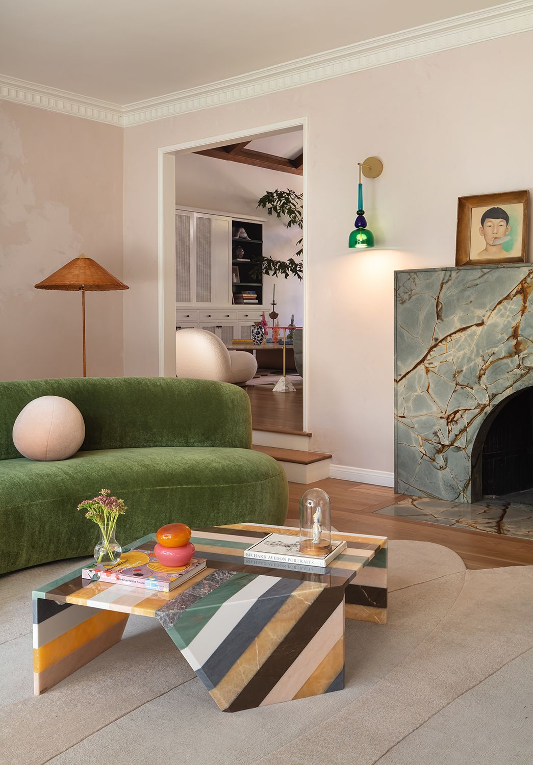
If you look closely at the decor of the formal sitting room, you’ll notice that no color appears only once, and that through lines between the pieces and hues used bring these seemingly disparate pieces together to form one cohesive scheme.
‘Our intention was to use the coffee table – which was our original focal point of design in the room – and build the additional elements inspired around that,’ Azar says. So its green stripe is picked up in the sofa and wall light, the blue reappears in the fireplace and wall light, the white is used around the door and the pinky-beige appears on the rug and walls. This attention to detail is a way to include pieces that are as bold as the coffee table, without making them seem out of place.
The wall is painted in Bardot Roman Clay from Portola Paints, giving it the beguling texture of a plaster effect. The wall light is from Giopato & Coombes, while the floor lamp is from Gubi. The sofa is by Pierre Augustin Rose, and the fireplace is made from Azul Mary quartzite.
(Image credit: Roberto Garcia)
The living room rug is made from wool and silk, and is from Liesel Plambeck. The two accent chairs are by India Mahdavi, and the ceiling light is from Giopato & Coombes.
Sense a pattern
(Image credit: Roberto Garcia)
Wander towards the kitchen and catch your first glimpse of wallpaper, one of the many that was the starting point for the whole scheme. Notice how the molding is the same grey-blue as as in the print, stopping the pattern from jarring.
And when it comes to the colors that go with blue, the greens and reds are picked up elsewhere too. A masterclass in how to use print in a serene way.
Just a dash
(Image credit: Roberto Garcia)
‘We wanted to bring a bold element into the organic, simple yet dynamic space,’ says Azar of the flash of print seen on the in-built bench seating.
The table in this open plan kitchen is actually deceptively simple – the ridges around the central legs nod to the trend for texture as seen on kitchen islands and cabinetry.
The fabric covering the window seat is Confetti by Pierre Frey. The table is custom designed by LALA Reimagined. The chairs are from Thonet.
Creative space
(Image credit: Roberto Garcia)
By using an area rug in the home office that’s almost as big as the floorspace, it allowed the homeowner to be quite flexible with his layout.
‘Being a creative, he likes to move his office arrangements around quite a bit,’ says Azar. ‘Having the rug so large provides that option – it means the furniture can sit anywhere.’
Farrow and Ball’s Vardo paint covers the wall, chosen ‘simply to be bold,’ Lia says. The rug is by Liesel Plambeckm, while the desk is by Bodil Kjaer for Karakter Copenhagen.
(Image credit: Roberto Garcia)
The relatively narrow hallway upstairs was the perfect place for Lia and Azar to include more wallpaper.
‘We wanted to bring in a little bit of a vacation vibe to the master suite hallway,’ Lia says. The wallpaper is Palm Jungle by Cole and Son, and its tropical print is a considered contrast to the geometry of the rug.
‘The palm is an organic form from nature while the rug features structural geometric shapes,’ Azar points out. ‘For us it creates a balance of artistry.’
All white on the night
(Image credit: Roberto Garcia)
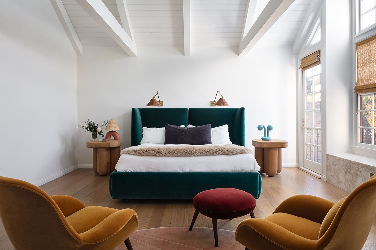
The modern bedroom is an apparent moment of calm, Farrow and Ball’s Wimborne White on the walls being an unexpected choice amongst so much color elsewhere.
‘We wanted to keep the walls bare to really make the upholstery color choices the focal point,’ Azar says. ‘This approach keeps the cohesion of the jewel tones.’
The bed and bedside tables were both custom made by LALA Reimagined, the wall sconces are by Arteriors.
Big and small
(Image credit: Roberto Garcia)
The tiny floor tiles were already in this modern bathroom, so Lia and Azar wanted to play off this for the wall decoration.
‘The wallpaper mural was used intentionally to create contrast,’ Azar says ‘Tiny tiles vs vast mural – it’s perfect!’ The mural is by Gucci, and all the fixtures and fitting are from Waterworks. The freestanding towel rail is a vital part of what Lia talked about being the vibe for the whole house – that of being in a wonderful bijou hotel.
See more work by LALA Reimagined (opens in new tab)
